Hello,
I try to customize the calm design to my purpose.
I enabled a border for the product table with this.
         border: 1px solid black;
         border-collapse: collapse;
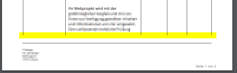
But I dont get a border at the bottom while the page has a page break.
would need to see your full invoice design to troubleshoot
I used the default “Calm” design and this is my CSS:
<style id="style">
    @import url($font_url);

    :root {
        --primary-color: $primary_color;
        --secondary-color: $secondary_color;
        --line-height: 1.6;
    }

    body {
        -webkit-font-smoothing: antialiased;
        -moz-osx-font-smoothing: grayscale;
        font-family: $font_name, Helvetica, sans-serif;
        font-size: $font_size !important;
        zoom: 80%;
    }


    table tr td, table tr, th {
        font-size: $font_size !important;
    }

    html {
        margin: 0;
        padding-top: 1rem;
        padding-left: 4rem;
	    padding-right: 4rem;
    }

    @page {
        margin: 0 !important;
        size: $page_size $page_layout;
    }

    p {
        margin: 0;
        padding: 0;
    }

    .header-wrapper {
        display: grid;
        margin-top: 2rem;
        gap: 20px;
        grid-template-columns: 2fr 1fr 1fr;
        grid-template-areas: "a b c";
        grid-auto-columns: minmax(0, 5fr);
        grid-auto-flow: column;
        justify-content: left;
    }

    .header-wrapper2 {
        display: grid;
        margin-top: 2rem;
        gap: 20px;
        grid-template-columns: 2fr 2fr auto;
        grid-template-areas: "a b c";
        grid-auto-columns: minmax(0, 5fr);
        grid-auto-flow: column;
        justify-content: left;
    }

    .company-logo {
/*        max-width: 65%;*/
        max-width: $company_logo_size;
    }

    .logo-container {
        display: flex;
        flex-direction: column;
    }

    .company-container {
        display: flex;
        flex-direction: column;
    }
    .client-and-entity-wrapper {
        display: flex;
        padding: 1rem;
        border-top: 1px solid #d8d8d8;
        border-bottom: 1px solid #d8d8d8;
    }

    .header-wrapper #company-address {
        display: flex;
        flex-direction: column;
        line-height: var(--line-height);
    }

    .header-wrapper #company-details {
        display: flex;
        flex-direction: column;
        line-height: var(--line-height);
    }

    .header-wrapper #entity-details {
        padding-right: 0.5rem;
        text-align: left;
        line-height: var(--line-height);
        width: 100%;
    }

    .header-wrapper #entity-details > tr,
    .header-wrapper #entity-details th {
        font-weight: normal;
        white-space: nowrap;
    }

    .header-wrapper
    #entity-details
    [data-element='entity-balance-due-label'],
    .header-wrapper
    #entity-details
    [data-element='entity-balance-due'] {
        background-color: #e6e6e6;
    }

	#entity-details {
        text-align: left;
        width: 100%;
	}

	#entity-details th {
        font-weight:normal;
        line-height: 1.5rem;
        padding-right: 2rem;
	}

    #client-details {
        display: flex;
        flex-direction: column;
        line-height: var(--line-height);
    }

    #shipping-details {
        opacity: $show_shipping_address_visibility;
        flex-direction: column;
        line-height: var(--line-height);
    }

    [data-ref="table"] {
        margin-top: 2rem;
        min-width: 100%;
        table-layout: fixed;
        overflow-wrap: break-word;
        border: 1px solid black;
        border-collapse: collapse;

    }

    .task-time-details {
        display: block;
        margin-top: 5px;
        color: grey;
    }

    [data-ref="table"] > thead {
        text-align: left;
        border: 1px solid black;
        border-collapse: collapse;

    }

    [data-ref="table"] > thead > tr > th {
        padding: 1rem;
        background-color: #f5f5f5;
        border: 1px solid black;
        border-collapse: collapse;
    }

    [data-ref="table"] > thead > tr > th:last-child {
        text-align: right;

    }

    [data-ref="table"] > tbody > tr > td {
        border-bottom: 1px solid #e6e6e6;
        padding: 0.75rem;
        border: 1px solid black;
        border-collapse: collapse;
    }

    [data-ref="table"] > tbody > tr > td:last-child {
        text-align: right;
        border: 1px solid black;
        border-collapse: collapse;
    }

    [data-ref="table"] > tbody > tr:nth-child(even) {
        background-color: #f5f5f5;
    }

    #table-totals {
        margin-top: 0.5rem;
        display: grid;
        grid-template-columns: 1.5fr 1fr;
        padding-top: .5rem;
        gap: 80px;
        page-break-inside:auto;
        overflow: visible !important;
        font-weight: bold;
        line-height: var(--line-height);

    }

    #table-totals .totals-table-right-side>* {
        display: grid;
        grid-template-columns: 1fr 1fr;
    }

    #table-totals>.totals-table-right-side>*> :nth-child(1) {
        text-align: left;
        margin-top: .25rem;
        padding-left: 7px;
    }

    #table-totals>.totals-table-right-side> * > :not([hidden]) ~ :not([hidden]) {
        --tw-space-y-reverse: 0;
        margin-top: calc(.25rem * calc(1 - var(--tw-space-y-reverse)));
        margin-bottom: calc(.25rem * var(--tw-space-y-reverse));
    }

    #table-totals>.totals-table-right-side>*> :nth-child(2) {
        text-align: right;
        padding-right: 0px;
    }

    #table-totals
    > *
    [data-element='total-table-balance-due-label'],
    #table-totals
    > *
    [data-element='total-table-balance-due'] {
        font-weight: bold;
    }

    #table-totals > * > :last-child {
        text-align: right;
        padding-right: 1rem;
    }

    [data-ref="total_table-footer"] {
        padding-left: 1rem;
        padding-right: 1rem;
    }

    [data-ref="totals_table-outstanding"] {
        color: var(--primary-color)
    }

    /** Markdown-specific styles. **/
    [data-ref="table"] h3 {
        font-size: 1rem;
        margin-bottom: 0;
    }

    [data-ref="totals_table-outstanding-label"],
    [data-ref="totals_table-outstanding"] {
        background-color: #e6e6e6;
        color: black;
        padding-top: 7px;
        padding-bottom: 7px;
        padding-right: 7px;
    }

    [data-ref="statement-totals"] {
        margin-top: 1rem;
        text-align: right;
        margin-right: .75rem;
    }

    [data-ref*=".line_total-td"] {
        white-space: nowrap;
    }

    .repeating-footer,
    .repeating-footer-space {
        height: 150px;
    }

    .repeating-header {
        position: fixed;
        top: 0;
    }

    .repeating-footer {
        position: fixed;
        bottom: 0;

    }

    #header {
        position: fixed;
        top: 0;
    }

    #footer {
        position: fixed;
        bottom: 0;
        border-top: 1px solid #000;
        width: 82%;
        min-height:100px;
        padding-top: 0.5rem;
        margin-top: 40px;
        font-size: 10px;
    }

    [data-element='product_table-product.description-td'], td {
        min-width:100%;
        max-width: 300px;
        overflow-wrap: break-word;
    }

    [data-ref="total_table-public_notes"] { font-weight: normal; }
    [data-ref="total_table-terms"] { font-weight: normal; }

    /* [data-ref="shipping_address-label"] {
        display: none;
    } */

    .stamp {
      transform: rotate(12deg);
        color: #555;
        font-size: 3rem;
        font-weight: 700;
        border: 0.25rem solid #555;
        display: inline-block;
        padding: 0.25rem 1rem;
        text-transform: uppercase;
        border-radius: 1rem;
        font-family: 'Courier';
        mix-blend-mode: multiply;
        z-index:200 !important;
        position:  fixed;
        text-align: center;
    }

    .is-paid {
        color:  #D23;
        border: 1rem double  #D23;
        transform: rotate(-5deg);
        font-size: 6rem;
        font-family: "Open sans", Helvetica, Arial, sans-serif;
        border-radius: 0;
        padding: 0.5rem;
        opacity: 0.2;
        z-index:200 !important;
        position:  fixed;
        display: $show_paid_stamp;
    }

    .project-header {
        font-size: 1.2em;
        margin-top: 0.1em;
        margin-bottom: 0;
        padding-bottom: 0;
        margin-left: 0;
        margin-right: 0;
        font-weight: bold;
        color: #505050;
    }

    .pqrcode {

    }

    /** Useful snippets, uncomment to enable. **/

    /** Hide company logo **/
    /* .company-logo { display: none } */

    /* Hide company details */
    /* # > * { display: none } */

    /* Hide company address */
    /* #company-address > * { display: none } */

    /* Hide terms label */
    /* [data-ref="total_table-terms-label"] { display: none } */

    /* Hide totals table */
    /* #table-totals { display: none } */

    /* Hide totals table left side */
    /* #table-totals div:first-child > * { display: none !important } */

    /* Hide totals table right side */
    /* .totals-table-right-side { display: none } */

    /** For more info, please check our docs: https://invoiceninja.github.io **/
    /** To find out selectors on your own: https://invoiceninja.github.io/docs/custom-fields/#snippets **/
</style>
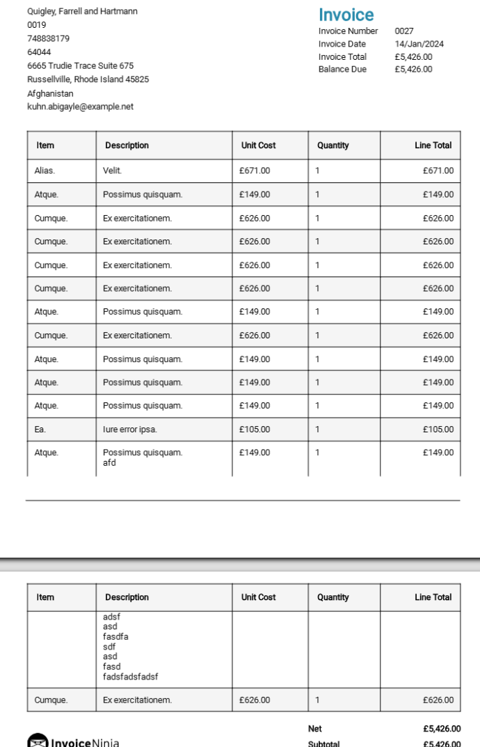
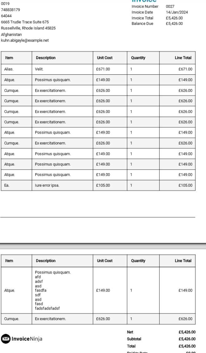
I added page-break-inside: avoid; to [data-ref="table"] > tbody > tr > td
    [data-ref="table"] > tbody > tr > td {
        border-bottom: 1px solid #e6e6e6;
        padding: 0.75rem;
        border: 1px solid black;
        border-collapse: collapse;
        page-break-inside: avoid;
    }
This makes the overflowing rows get moved to next page so there isn’t a row that gets split between two pages.
Here is example of the multi page invoice before this change (the last row on first page is getting extended):
and there is the invoice after this modification is added (the large row gets moved to next page):
2 Likes
@icedroit Thank you for your good example. That helped me very much! 
1 Like