I just noticed that when displaying graph data on the dashboard, the blue “active” data line renders behind the grey “previous” data line. it’s a small thing, but it does mean wherever the lines match, the blue line disappears.
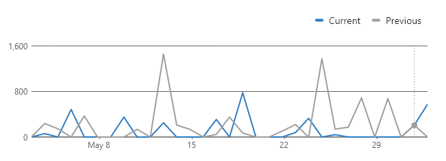
I just noticed that when displaying graph data on the dashboard, the blue “active” data line renders behind the grey “previous” data line. it’s a small thing, but it does mean wherever the lines match, the blue line disappears.
Hi,
Thanks for the feedback, we’ll look into it.