The v4 dashboard graphs show the Invoices/Exepenses/Payments in one graph. This was fantastic for being able to see money in/out at a glance. These are seperate graphs, all in the same color in V5. Makes no sense.
I get paid maybe 5 times per year (im not retail). This means that graphs in v5 are just spikes. The period for the graphs is just a spike that’s just one day long. This doesn’t provide relative information like v4 did. Multi-month graphs should show Invoices totaled that month, not by day.
Also, when looking at data “Last Year” is literally just last year. If Jan 2020, then the graph shows only 2019. I have to constantly define a custom data range to just show the last 12 months instead of “Last Year”. “This Year” would just show January. We want to see 12 months of the last year from any date, and in week or month units. The graphs look good but are mostly useless unless you’re a retailer wanting to see last year’s business verse this years numbers.
Here’s a link. How do we get this graph in v5?
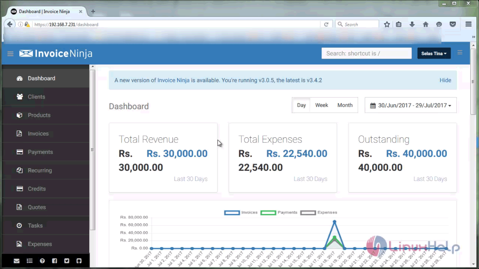
I also miss this graph version.
Thanks for the feedback! We’re continuing to develop v5, improvements to the dashboard are high on the list.
Note: we divided the charts in v5 to be able to show comparisons against previous periods. We plan to add an overview page in the v5 dashboard which will provide the best of both versions.
I really appreciate it. Your tool is amazing and it’s really helping my business. I’m jealous that I didn’t come up with something like this. Let us know if you want a mock-up or anything. We do a lot of code.
From a user perspective, I’ve had time to think on this:
- one graph with checkboxes to turn on/off inputs (Invoices/Expenses/et)
- an up/down button to change the timeline, or a scroll wheel event, (keep the calendar for isolating the dates too).
- A moving-point or rolling-average trend line that can be set by day/week/month. ← this last one would really help people see their books at a glance.
1 Like